Have you ever read a brochure and kept thinking about the content even after you’d closed the pages?
Perhaps you’ve done further research on a particular product, or even made an order after thumbing through the brochure? If so, that brochure has done exactly what it intended to; it’s combined all the right ingredients to make an impact on readers, and drive real results for that business.
Even in an increasingly digital age, there is something special about the tangibility of a well-executed printed brochure. Whether sitting at home poring over vivid imagery in a beauty product catalogue, or browsing through a local estate agent’s standout properties, the way that printed brochures captivate potential customers is timeless.
So how can you ensure your printed brochure has the same powerful effect on your audience? Contrary to popular belief, it’s not just about understanding what a brochure should include. It’s also about understanding how to incorporate the most effective style, design, and formatting elements that both engage the reader and help create a seamless flow of relevant information throughout the entirety of the document.
That said, it’s important to remember that the potential visual impact of your brochure goes far beyond the basics of glossy front covers. Each stage of the creative, design, and print process plays a significant role in the overall quality of the finished product.
So what steps can you take to ensure your printed materials have a powerful impact and deliver a positive return on investment for your brand or organisation?
First things first, do you need print or is digital the better choice?
Today, digital is often seen as the holy grail of business communications. In the past decade, we’ve seen a wholesale shift to online mediums such as social media and search engine advertising. As you sit down to design the best possible printed brochure for your business, you may find yourself wondering if you really do require a printed brochure, could a digital online pdf version suffice?
Despite living in a digital age, there are numerous business benefits to using printed brochures that you simply can’t get from a digital copy.
 Recognising these benefits and understanding the role of print for the modern consumer can help you deliver the best possible printed material into your target audience’s hands:
- Printed brochures are entirely visible, whilst the internet does provide quick and easy way to buy goods, the content you are looking is quite often hidden behind competing websites within a search engine, or banner ads, cookies, and data collectors to name just a few. Consumers still value paper-based communication and printed materials are right there, when you want them.
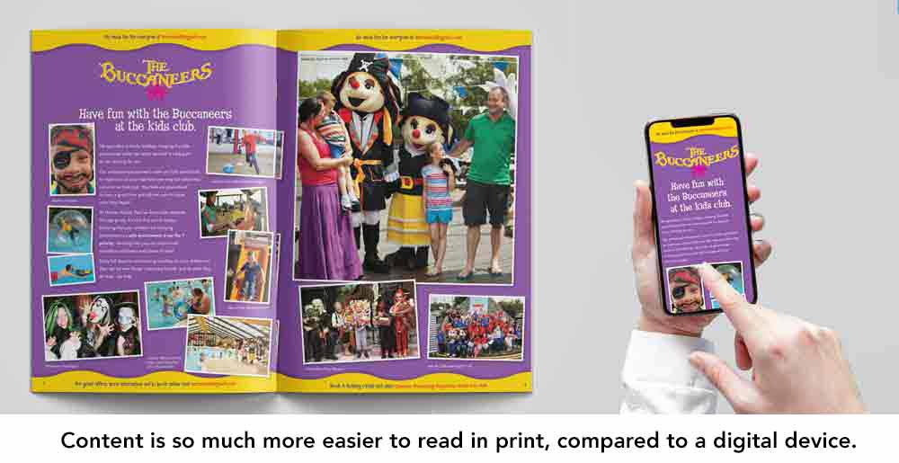
- While there’s no notable difference in reading times, studies have found that reading performance is typically better when consuming information from printed materials rather than from screens. It’s also been shown that people absorb, comprehend, and retain more information when reading from print.
- Research shows that printed materials are simply more enjoyable to read than digital screens. One study found that, even though participants didn’t rate reading from a screen as particularly difficult or effortful, the majority still preferred to read from printed materials and would choose this where possible.
It’s very difficult to digest large amounts of information on a mobile device, an average brochure double-page spread takes 3-4 times as long to read digitally than a physical printed brochure, this is mainly due to the amount of scrolling needed.
Reports suggest that two-thirds (63%) of small businesses use traditional print marketing to facilitate a personal connection with their clients. Printed brochures are more likely to be read and, more importantly, audiences are more likely to enjoy reading them. Brand awareness, positive associations with the brand, boosted reputation, and growing loyalty are all business benefits that can be seen with printed brochure compared to a digital only version.
How to define the purpose of my brochure?.
The starting point for designing any powerful printed brochure is always to ask yourself ‘why?’. Why are you creating this brochure? What is its purpose? Who needs it? Understanding the reasoning and objectives behind investing in a printed brochure is ultimately what’s going to shape practically every single aspect of the creative process.
For example, knowing why you’re embarking on this project can:
- Help to determine if your brochure should be information led or product led
- Identify the type of content that should be included, and how it’s displayed to the reader
- Highlight the solutions the brochure should solve, or questions it should answer to entice your prospect further along the sales funnel
- Make it easier to select the right brochure type for the purpose
Another benefit of asking ‘why?’ is that understanding the purpose of your brochure can help you to develop the most effective tone of voice for conveying your message.
For example, if you’re creating a brochure to generate new leads, a welcoming and accessible tone of voice can help to bring people in. If you’re creating a brochure to boost sales, a persuasive and motivational tone of voice may be more effective, and if you want a brochure to show authority, then being neat professional is a must.

Tone of voice, or TOV, is something that businesses tend to struggle with the most when it comes to creative materials. When businesses communicate through multiple channels such as their website, social media platforms, and print, consistency is vital.
However, that doesn’t mean that you need to employ the same TOV for your brochure as you do for your website. What’s important here is to maintain a consistent message; you can still adapt your tone of voice to ensure that your brochure carries out its purpose. Remember: tone of voice is not about what you say. It’s about how you say it.
How do I decide on an appropriate format for a printed brochure?
Once you have a comprehensive understanding of why you’re creating a brochure, who it’s for, and the type of brochure that’s going to help you to deliver the right message, the next step is thinking about style and format. Utilising the correct style and format so readers can better relate to the content and engage with your messaging is paramount to success.
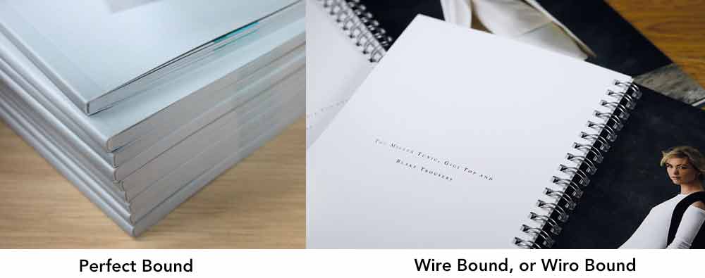
Deciding on how your brochure will be ‘bound’ is something else to consider. Choosing the right brochure binding is normally governed by the number of pages you require. Everyone knows what Stapled is, the most common of binding used in brochures and can be used for a few as 8 pages, but is not really suitable for more than 48 pages. Whereas Perfect Bound or Wire bound allow for many hundreds of pages. Whether you’ve decided on a stapled brochure, a perfect bound brochure, or a wire-bound brochure, there are still a number of format options available to think about before you can get to the question of style.
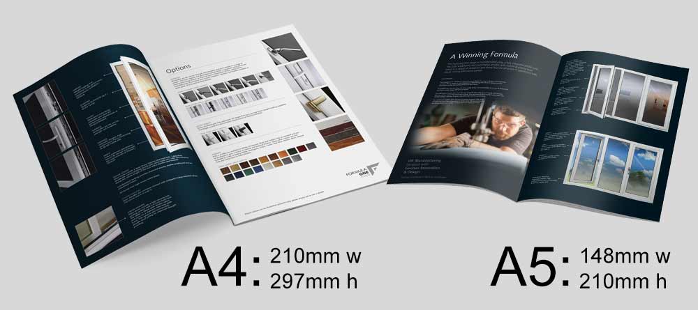
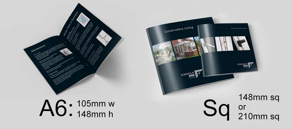
Initially, you’ll want to consider the size you want your brochure to be printed at. The most common brochure sizes are A4, A5, and A6. Each size has its own advantages:
● A4 brochures are probably the most versatile. They can be used for pretty much anything, and are a standard size that many customers have come to expect.
● A5 brochures are half the size of A4. They’re large enough to incorporate images – and make them standout – but are a little more portable than A4 sizes.
● A6 brochures are very compact. While images may not be as powerful due to their small size, A6 brochures are perfect for specifications and guides which rely more on text than imagery.
● A square shaped brochure is also an option. This has become very popular over recent years, as it stands out against the more traditional ‘A’ sizes. These are typically available in 210mm square and 148 mm square.
● There’s also the possibility to have your brochure printed in a bespoke size, too. You will need to keep in mind that non-standard sizing, while potentially eye-catching – you may run into difficulty sourcing non-standard size envelopes if you are considering mailing it out.
Keep in mind that the size you choose will determine what’s possible style-wise; an A4 brochure for example, will give you more room for larger, bolder images than an A6 brochure would.
A kitchen design company for example, having an image-heavy brochure is essential. This allows the reader to really see and appreciate features such as stainless steel kitchen appliances and the expansive colour options and can lead them to imagine themselves cooking and eating in the kitchen. You’ll therefore want as much space as possible for those beautiful images, making an A4 brochure a better fit than an A6.
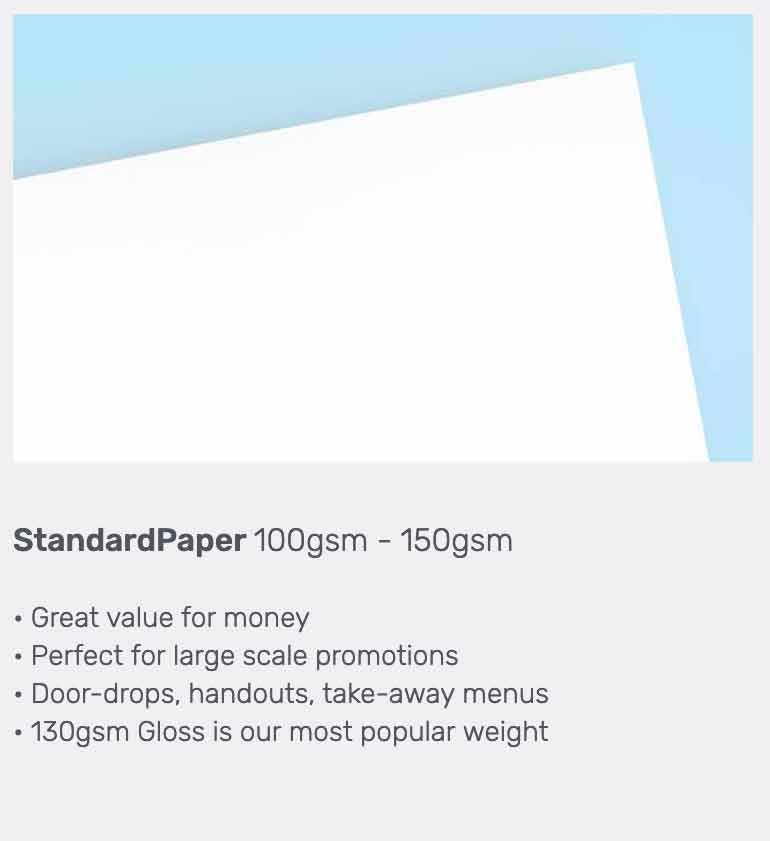
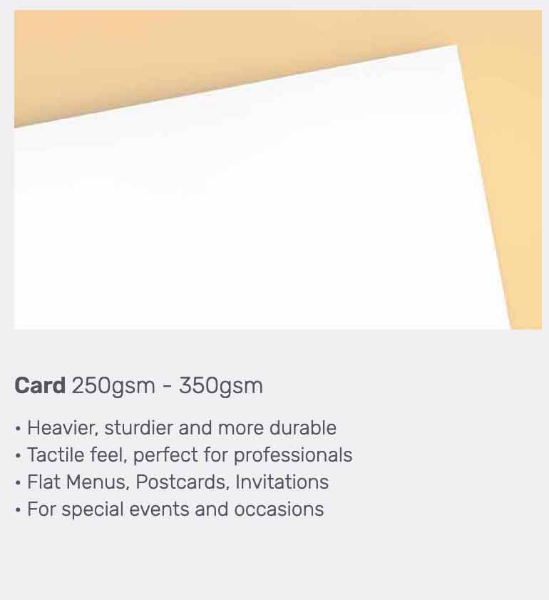
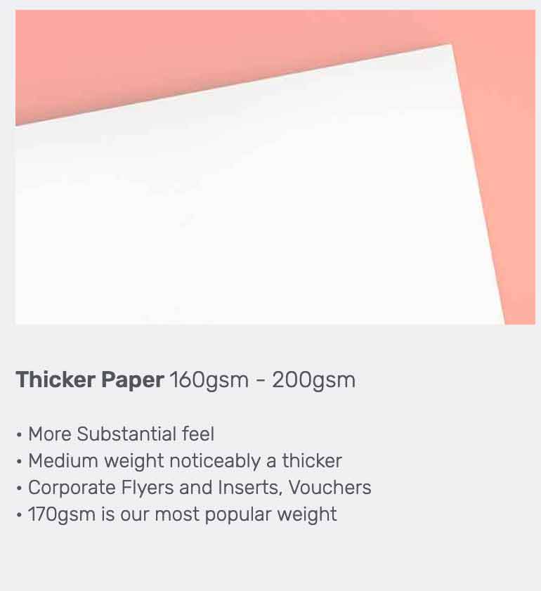
What paper weight should my brochure be?
Another aspect to think about at this stage is paper weight. Paper weights vary all the way from 100gsm to 350gsm, with the higher the weight, the thicker the paper.
A higher weighted paper is often used to convey a sense of luxury – perfect if you wish to convey a sense of style, exclusiveness or tradition but not so good if you’re a charity wishing to raise money and don’t want to give the impression of having diverted a huge amount of money towards your marketing assets. Standard inner papers are typically 130gsm or 170gsm, and the most popular outer cover material is 250gsm or 350gsm
Do You need Brochure Printing?
Order today before 1pm, Get Next Day Delivery
What colour should my brochure be?
Between 62-90% of people make an assessment of a product based on colour alone, so choosing the right colours for your brochure can be considered to be the equivalent to making a good first impression, laying the groundwork for reader engagement, colour provides strong visual statements that try to communicate to the seller what is being sold.
It’s worth thinking about some of the psychological effects that huge consumer brands have considered when devising colour palettes, which can be used to influence how your company or organisation will appear to your audience, this is not only true in the colours chosen for a brochure but it should be the cornerstone of your brand. They are vitally important.
Colours can evolve over time and adapt to changes in the marketplace.
 The corporate colours of the McDonalds food chain originally had its famous classic yellow arches with a red background, vibrant and striking and the go-to colours for all fast food at the time, yet the background red was altered around 2012 to a sage green and yellow to offer to promote a more eco-friendly image. Also gone are the garish red and yellow furniture, which were originally designed for the fast food experience, which promoted a much quicker turnover of diners in the restaurants, the interiors have now been replaced with a more sedate and comfortable surroundings which promote a more relaxing laid back dining experience.
That said, Coca Cola’s striking red for example is possibly the most recognised branding in the world, and they would never change it for anything. The red was originally used 130 years ago to highlight to vendors selling the drink it was non-alcoholic and therefore exempt from tax, the red and white logo became recognised and the rest is history.
If Coca-cola were to launch as a new company today, it’s unlikely they would opt for bright red as its main colour. Red alone is usually associated with warning, danger, blood and revolution. Even today, the red is still seen as exciting, but as new products have been launched the red has been toned down with other colours such as silver and greys for the diet alternatives of the drink.
Your choice of colour needs to be a reflection of your brand identity.
It’s important that you chose the right colours, it’s not just about what you like or what looks nice, it can affect how customers see your business, colour can send out a positive or negative subconscious image of your company.
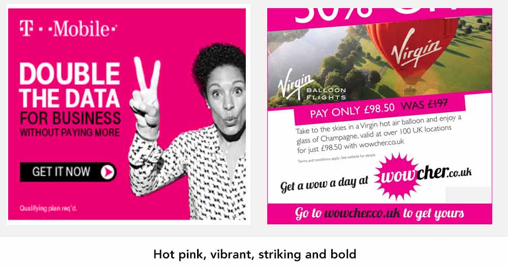
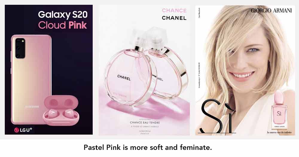
When creating your brand colour palette, you will also need to think about hues, shading, tint, and saturation, as all of these colour effects will play a role in the ‘mood’ of your brochure. To put this into context, think about the colour pink. A soft pink with low saturation suggests romance. It’s delicate and feminine. Up the saturation levels and you get a hot pink hue, which by contrast is much bolder and stronger.
There’s another consideration, too: brand identity. It reflects your brand’s personality and gives clues as to your products and services. Frustratingly, there isn’t always a right or wrong answer as to which colour your brand should be, because oftentimes, our perceptions of colour are shaped by our own experiences.
As HelpScout explains, “There are no clear-cut guidelines for choosing colours for your brand. While it would be nice to be able to simply look at an infographic and make the right decision, the reality is that the answer to “What colours are right for my brand?” is always “It depends….In a 2006 study, researchers found that the relationship between brands and colour hinges on the perceived appropriateness of the colour being used for the particular brand. In other words: Does the colour fit what’s being sold?”
Try to select a colour palette that walks the fine line between maintaining consistency in your multi-channel branding, and delivering the message you want your brochure to convey.
Certain colours have over time become associated with brands and particular business markets they operate in.
What colour should my branding be?
It has to be said that colour most certainly defines a brand. Red, Blue, Green and Orange are easily the most popular.
 |
Red equates to excitement, vitality and love, but can also mean caution and danger. |
 |
Blue evokes trustworthiness, honesty and professionalism. |
 |
Orange is an inspiration and enthusiastic, but be warned (sorry for the pun) it’s also used for warnings on dangerous materials and chemicals. |
 |
Green is harmonious and calm, as it’s associated with nature then perfect for eco-friendly and healthy brands. Yellow is or happiness and positivity as it’s associated with sunshine, but it’s often paired with another colour as it’s too weak to stand on its own. |
Other colours such as Purple signifies quality and luxury, it’s also associated with creativity and a choice for companies offering something new and original. Black is sophisticated and elegant and has always meant high-end luxury goods, especially when paired with silver or gold. Companies who opt for a multicoloured approach to their brand marketing are often offering multiple products they want to be individual and not tied down to just one market sector.
What design elements will help my printed brochure to stand out?
Design elements make your brochure stand out from the printed materials created by your competitors. When creating your printed brochure, there are plenty of clever design elements to play around with and test out that can make for an appealing aesthetic, framing your brand story or product in the most striking way possible.
- Only a few years ago it was thought that printed materials would be merged with augmented reality technology, meaning you could quite literally bring your brochures to life, but this never really took off.
- Incorporating tabs to delineate each section of the brochure helps the user to navigate to their desired information quickly, but is also a distinctive element which catches the eye, especially if the tabs use contrasting colours. This is common if a brochure or catalogue is content heavy, allowing readers to jump to sections of interest quickly.
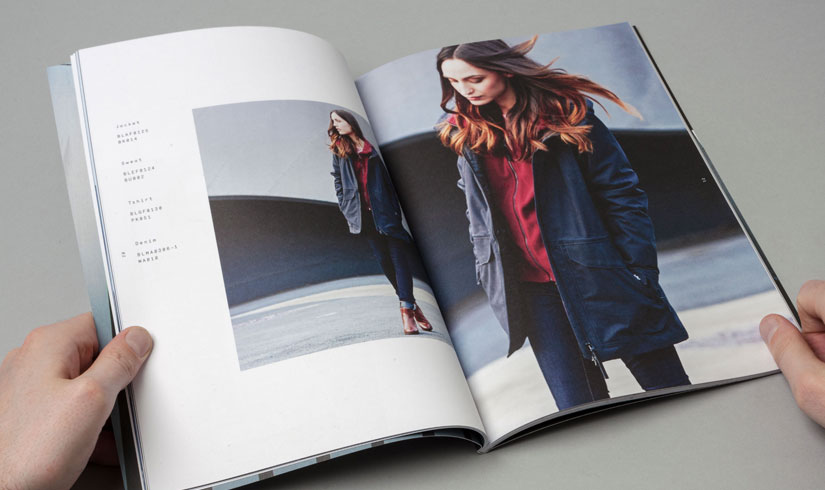
- Picture selection is vitally important. Striking, impactful imagery will immediately elevate your brochure’s appeal. Play around with image size and placement as well as the image selection itself until you land on a composition that is visually appealing.
If all this is this too much?, then it begs the next question…
Do I need a professional graphic designer to design my brochure?
The answer to this question will undoubtedly come down to budget.
Obviously, if you can afford to hire a designer then probably unlikely to be reading this article in the first place won’t be reading this article, but unless you are a dab hand at design and marketing then you could find that your newly printed brochures aren’t going to be effective and could end up costing you much more than just the cost of the printing. The rather tired cliche “you only get one chance to make a first impression” is very true when it comes to all forms of marketing and print promotion. If your potential customers receive a badly designed, poorly executed brochure – then this will damage your brand and the opportunity to sell to them will be lost, in some cases forever.

It’s still possible to produce a quality brochure yourself with some limited help. If you do all the leg work by compiling the brochure yourself, write all the copy, take all the photos and then only use the services of a graphic designer at the very last minute to work their magic on the layout to give you the desired results you are after.
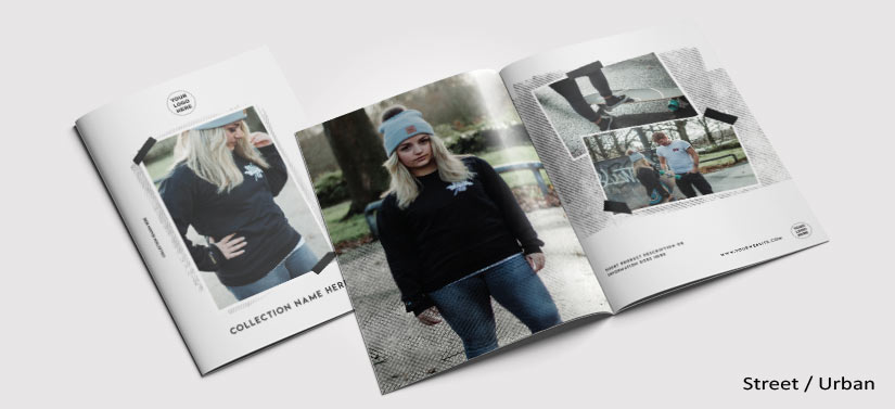
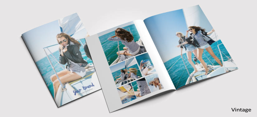
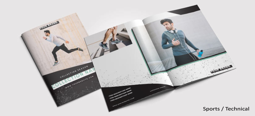
Need some more inspiration?
We have used Adobe InDesign to create 3 brochure layouts at A5 size, pinpointing three popular styles: Urban /Street, Vintage and Sports Technical. Teh content has been based around clothing, but you can adapt the designs to suit your companies products and sevices. All are free to download, just click the images below.
Sumary
Your brochure is not going to be the only one out there.
But it could be the only one with good design, well printed onto quality materials that make it more appealing, more engaging, and ultimately more memorable than the rest of the materials on offer.
The specific mix of what makes your brochure stand out in your field will depend on what your competitors are doing. So why not request a brochure from your competitors and take stock of the market you are competing in. At least this way you can see what you are up against, see how their brochure could be improved and get the insight into what you need to do to succeed them.
This takes us all the way back to the question we asked right at the beginning: have you ever read a brochure and kept thinking about the content even after you’d closed the pages? The answer that every business wants to hear from their audience is ‘yes’. It’s clear that the very best way to get this answer from customers and clients is to take your time, maybe get professional design and marketing help if you need to, put your best foot forward and create a powerful printed brochure that really drives impressive results.
Need help with your Brochure Printing?
We understand that creating a brochure can be challenging. We can help with the design and offer fast, efficient and high quality brochure printing services.
Browse our brochure printing solutions here., or give us a call or email us if you would like to discuss how we can help Call: 01952 850730 or Email us here
Dean Williams is a design and marketing blogger working for Print-Print Limited, promoting business and building brands through quality print marketing. If you’re interested in small business promotion then please get in touch hello@print-print.co.uk