
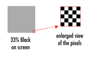
Breakup of dots with small tinted text
 Full colour printing is achieved by a mixture of dots in order to create any colour. The percentage of CMYK colours used within this mixture then determines the colour which is printed. This technique works perfectly well until its used on thin lines or thin fonts.
Lets say you want to create a grey which is 33% black. This is formed by using a percentage of black and white dots. So for every solid black dot there is also 67% of white intermittent dots used to visually create the appearance of grey.
This high percentage of white dots means that a lightweight or small font or even a thin line can affect the overall finished result, and can cause the font to look weak or or broken up.
The only way to counteract this problem, is to print the grey as a special ‘spot colour’ or to
increase the font thickness so when the white dots are used to create the grey it doesn’t
end up eating away at the font. So tinted fonts which are either thin, small or very ornate will always struggle to look good, and are probably best avoided.
Another way of avoiding this line breakup would be to alter the resolution and use use finer dot with the screen ruling on the plates. Smaller, finer dots would visually help this problem to not look too bad. But that’s another story, maybe we’ll write a blog to explain it another day.

Danny Molt is a design and marketing blogger working for Get-Printing Limited, promoting business and building brands through quality print marketing. If you’re interested in small business promotion then please get in touch hello@get-printing.co.uk